In the Digital Age, maps are closer to us than ever before—a quick tap on a smartphone and you’re off to the nearest Starbucks for a quick coffee stop. Like other popular technologies, maps are critical tools that we use to interact with and understand the world around us. They are simplified depictions of our surroundings, crafted from human experience and made for a purpose. Maps cannot be disconnected from the minds and cultures that decide what to depict, where, and how. Purely factual tools of navigation on the surface, maps transmit and reinforce cultural understandings of our place in the world.
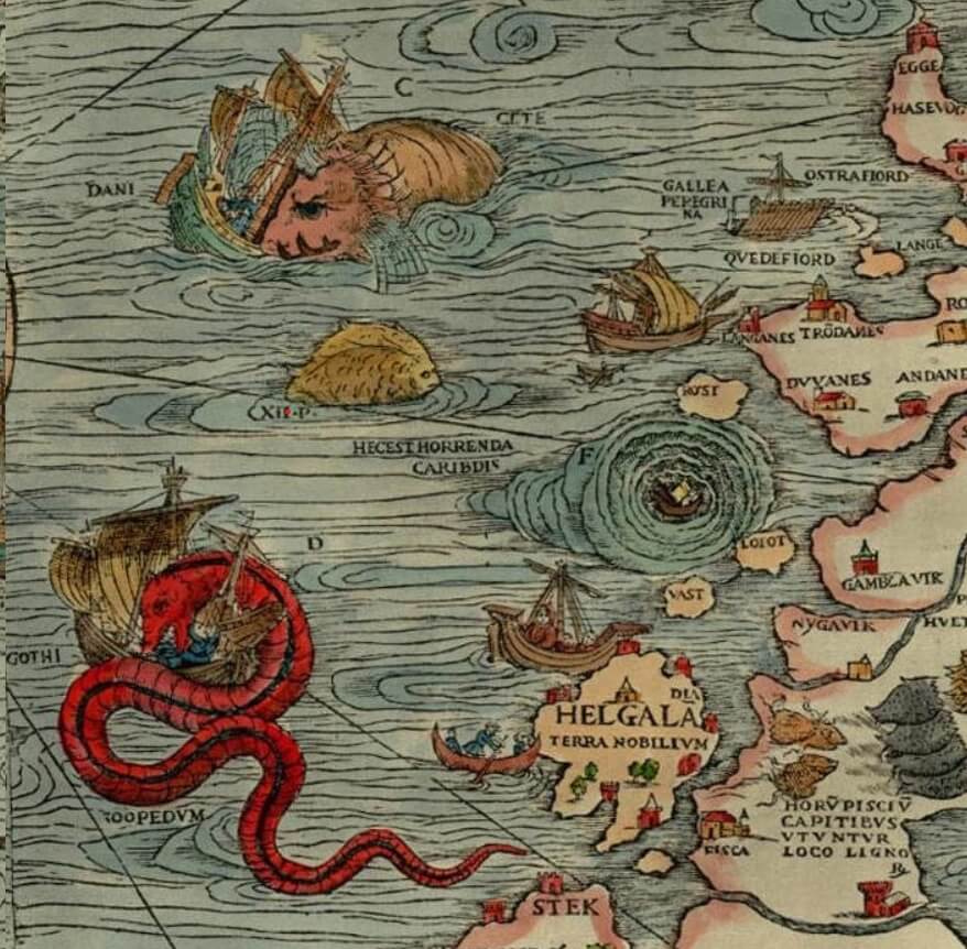
Olaus Magnus’ map of Scandanavia (Public Domain)
“Here be Dragons”
Popularized by many a fantasy novel, perhaps one of the handiest examples is that genre of maps depicting beasts and monsters, sometimes accompanied by text along the lines of “Here be Dragons.” While the phrase “Here be Dragons” is exceedingly rare, medieval and Renaissance maps featuring images of beasts including dragons were quite common (Blake 1999; Van Duzer 2017). The phrase “Here be Dragons” may be based on a real ostrich egg globe and what is likely its metal cast, the so-called “Hunt-Lenox” or simply “Lenox” globe, both ca. 1504-1510. Both bear the phrase “HC SVNT DRACONES” and contain images of ships and sea beasts (Missinne 2013; University of Rochester 2020; Verhoeven and Missinne 2017).
The subtext to these maps is straightforward. Such maps communicate to their readers that the unknown is something to be feared and, further, defeated and conquered. Dragons were understood to be symbols of sin, related to the biblical snake, and other beasts similarly depraved (Blake 1999; Verhoeven and Missinne 2017). Certainly, this interpretation is borne out by the subsequent tale of Western colonization and enduring dehumanizing rhetoric that casts foreign peoples as barbaric, uncultured, and beast-like (Anderson 2000; Harley 1988).
Maps as World-building and Meaning-making
More subtly, modern maps also transmit information the creator or commissioner may or may not be aware that they are signaling. Similarly, the viewer may or may not be aware that they are consuming said information (Harley 1988; Nagajaj and Stern 2020). For instance, there are differences in how map phone applications display their content and what they show. In 2016, Justin O’Bierne conducted a comparative analysis of differences in how Google Maps and Apple Maps render the same geography. O’Bierne found that when compared, Google’s platform focused more on transit and Apple’s platform more on places and things to do. To help explain this difference, O’Bierne posits that Google’s partnership with Uber and Lyft could have something to do with it.
Conscious or unconscious decisions about how to depict geography are not always of such little consequence. With the rise of digital technology, it has become possible for anyone that wishes to collect, create, and analyze spatial data. The field of Geospatial Information Science (GIScience) began at least as far back as the early 19th century when French geographer Charles Picquet created a map showing where in France the cholera epidemic was most severe (Dempsey 2012). The invention of the computer gave rise to the technology of Geographic Information Systems (GIS) in the 1960s, which allowed researchers to analyze and represent spatial statistics in a way that had never been feasible before.
GIS technology is, at its core, simply a way of representing and analyzing spatial information with the use of computer technology. It has applications in a broad range of fields from archaeology to natural resource management to planetary science and beyond. Wherever information and space are involved, GIS is a relevant tool (ESRI, n.d.).
Visualizing COVID-19: GIS and Mapping the Virus
As the COVID-19 pandemic hit countries across the world, GIS suddenly became very visible. Before this point, technology users may not have been aware of the role GIScience had in their daily lives, but GIS-manufactured COVID-19 dashboards rapidly became a common feature across government websites (Goldsmith and Leger 2020). The text “powered by ESRI” that is on many of these dashboards indicates that the visuals were produced using the most popular commercial GIS software, ArcGIS.
The pandemic has placed GIS products at the center of daily life, guiding decisions and definitions about what is “safe” or “not safe.” With the politically charged discourse surrounding the pandemic, the potential for social harm is enormous. The intentional and unintentional decisions GIS specialists make when creating spatial information for public consumption have massive societal and ethical implications. The stakes are even higher now during the COVID-19 global pandemic.
During the summer of 2020, GIS professional Rebekah Jones came forward with accusations that she had been instructed to falsify Florida public health data. She said that she was instructed to alter, delete, and hide data that would reveal that the state was reopening before they met the requisite benchmarks. The goal was to mislead the public into believing that the state was controlling the pandemic better than they were. After raising her concerns, she was moved off of the project and subsequently fired (King, Martin, and Jones 2020). One would hope that there would be better safeguards against the misrepresentation of public health data, but Jones’s account reveals that the attempt to misrepresent data went alarmingly far—as false maps were produced and data briefly removed from the website.
While falsification of data does occur, misrepresentation of data is possibly more common. Some of this is likely intentional, but much occurs accidentally as well. The automation offered by GIS programs makes it possible to create convincing graphics without a complete understanding of statistics or an awareness of how some analytical tools are not suited to certain data.
Consider for a moment the humble pie chart. If someone were to create a visual representation of the number of deaths from COVID-19 for each country, the countries with the highest populations would generally appear to have astronomically higher rates of death than countries with smaller populations. If the same information were presented in percentages, the size of the wedges would more accurately represent the differences among countries. Similarly, in creating maps that show counts of cases or deaths by region rather than percentages or counts per “X” number of people, it is dangerously easy to provide misleading information to the public that can influence life and death decision-making.
Even if the person creating visual statistical information understands their data, statistics, the default settings built into the software, and how they should approach analysis, creating a graphic for public consumption requires other decisions. The graphical elements of scale, map extent, focus, projection, and color all play roles in how we understand information. Scale, or how “zoomed in” a map is, influences how many details can be included on the map. This requires the mapmakers to decide what they should and should not include. While some choices like the inclusion of labels for large cities over smaller cities are standard, the inclusion of minute features such as landmarks or non-chain restaurants is up to the discretion of the mapmaker.
A determination must also be made about the boundaries of the map. The inclusion or exclusion of certain regions indicates to the viewer that the excluded areas are not relevant to the purpose of the map. In some cases, this may communicate and reinforce certain worldviews. Do maps of the United States that exclude the bordering countries reinforce notions of separateness? Is a mapmaker that is against the idea of making Puerto Rico a U.S. state less likely to include the region on a map of the U.S.?
The focus of a map, or where it is centered, as well as its projection, or by what method a sphere is translated into a 2-dimensional image, factor greatly into how we see the world. There is a vast literature on the topic of how the standard depiction of the world, known as the “Mercator projection,” reinforces eurocentric ideas (Harley 1988). The Mercator projection features the European continent centrally on the map and, additionally, inflates the relative sizes of northern (largely colonizing) countries while decreasing the sizes of southern (largely “colonized”) countries. While causality of colonizing world events certainly cannot be attributed to one well-known model of the earth, the warping of country sizes contributes to the eurocentric perspective. Perhaps it is no question why that particular visual representation of the world is so popular.
In the case of the pandemic, the use of color is a particularly important consideration for how we communicate and interpret information. The pandemic has made the concept of “hot spots” a familiar term. In true hot spot mapping, the hot spots are not simply where there are high numbers of COVID-19 cases, they are areas where dense clusters of positive cases are statistically significant (Columbia Public Health 2021). Because these maps differentiate between statistically significant and insignificant areas, the “hot spots” are typically depicted in warm colors (e.g. red or orange) and the “cold spots” in cool colors (e.g. blue). With most data, that differentiation is useful. However, in a worldwide pandemic with no baseline “normal” to compare the data to, depicting so-called “cool spots” as such will not appropriately reflect the severity of the danger in those areas. On the flip side, representing an entire map in shades of yellow to red might lead to the impression that all places are equally high-risk.
Furthermore, a map is necessarily a simplified representation of the world. One map cannot communicate all the factors that should be considered when analyzing data, like completeness and reliability of data.
So, what does all this mean? In order to understand maps properly, it is crucial to recognize them as cultural objects: subject to bias and error like any other human product. As we encounter maps in daily life, perhaps we should ask ourselves: who made this? Why did they make it? What decisions went into making this? And, considering these questions, how should I interpret and use this map?
References
Anderson, Kay. “‘The Beast Within’: Race, Humanity, and Animality.” Environment and Planning D: Society and Space 18 (2000): 301-320. doi: 10.1068/d229.
Blake, Erin C. “Where Be Dragons?” Mercator’s World 4, no. 4 (July 1999): 80. https://link.gale. com/apps/doc/A55030575/AONE?u=googlescholar&sid=AONE&xid=52344f0a.
Columbia Public Health. “Hot Spot Spatial Analysis.” Last updated May 24, 2021. https://www.publichealth.columbia.edu/research/population-health-methods/hot-spot-spatial- analysis.
Dempsey, Caitlin. “History of GIS,” GIS Lounge (blog), May 14, 2012, https://www.gislounge. com/history-of-gis/.
ESRI. “What is GIS?” Last accessed May 26, 2021. https://www.esri.com/en-us/what-is-gis/overview.
Goldsmith, Stephen and Matthew Leger. “A Shining Moment for GIS: Responding to COVID-19 With Maps,” Data-Smart City Solutions (blog), September 1, 2020, https://datasmart. ash.harvard.edu/news/article/shining-moment-gis-responding-covid-19-maps.
Harley, J. Brian. “Maps, knowledge, and power.” In The Iconography of Landscape, edited by D. Cosgrove and S. Daniels, 277-312. Cambridge: Cambridge University Press, 1988.
King, Noel, Rachel Martin, and Rebbekah Jones. “Florida Scientist Says She Was Fired for Not Manipulating COVID-19 Data. Produced by NPR. Morning Edition. June 29, 2020. Radio interview, MP3 audio, 7:37:00. https://www.npr.org/2020/06/29/884551391/florida-scientist- says-she-was-fired-for-not-manipulating-covid-19-data.
Missinne, Stefaan J. “A Newly Discovered Early Sixteenth-Century Globe Engraved on an Ostrich Egg. The Earliest Surviving Globe Showing the New World.” The Portolan 87 (2013): 8–24.
Nagaraj, Abhishek, and Scott Stern. “The Economics of Maps.” Journal of Economic Perspectives 34, no. 1 (2020): 196-221. doi: 10.1257/jep.34.1.196.
O’Bierne, Justin. “Cartography Comparison.” Published 2016. https://www.justinobeirne.com/ cartography-comparison.
University of Rochester. “One of the world’s oldest globes is ready for its close-up.” Published February 26, 2020. https://www.rochester.edu/newscenter/worlds-oldest-globe-hunt-lenox- lazarus-project-417532/.
Van Duzer, Chet. “Hic sunt dracones: The Geography and Cartography of Monsters.” In The Ashgate Research Companion to Monsters and the Monstrous, edited by Asa Simon Mittman and Peter J. Dendle, 427-476. Routledge, 2017.
Verhoeven, Geert J., and Stefaan J. Missinne. “Unfolding Leonardo Da Vinci’s Globe (AD 1504) to Reveal its Historical World Map.” ISPRS Annals of Photogrammetry, Remote Sensing & Spatial Information Sciences 4 (2017). doi: 10.5194/isprs-annals-IV-2-W2-303-201.

1 Comment
If you haven’t done so already, please check out Hugh Brody’s (1982 or ‘3?) “Maps and Dreams.” Probably the best applied ethnography I’ve ever read. Applied in a ‘Social Impact Assessment’ study of proposed gas pipelines through northwest British Columbia, the study exposes the stark contrasts between ’emic’ and ‘etic’ maps and reveals them for the, as you say, ‘cultural objects’ that they are. Enjoy!